I thought it would be fun (and instructive!) to show what I consider one of my best covers alongside one of my worst.
The cover for Good Time Girl exactly portrays the mood and tone of the story inside--hot, sexy, and fun. I've had readers tell me they picked it up just because of the cover. (Yes!) I like it because of that, and because the art department got all the details (hair color, build, clothing, etc.) right. You'd be suprised how often they don't--and how much it can bug the author when the art department get's it wrong.
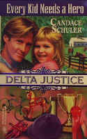
 In contrast, see the cover for Every Kid Needs a Hero. It's a hot, sexy romance, too, but you'd never know it by the cover, would you? Or the title, either, for that matter. (Which was most definitely not my choice.) This book was #5 in a special series called Delta Justice. Many readers thought the title was Delta Justice and didn't buy it because they thought they'd read it before. To date, it is my all time worst selling title--and I believe most of the fault for that is because of the cover.
 This third cover isn't my best or worst, it's my first. The book was published in 1984 and was a sexy romance--for the time. I loved (and still love) the cover simply because it was my first. But I am always bugged by the fact that the heroine has long, polished nails. She's a makeup artist (and a single mom) and I make a point in the story of mentioning that she keeps her nails short and unpolished for practicality. (I told you it bugs an author when the art department gets the details wrong!)
3 comments:
Candace, I thought Good Time Girl was a fun cover too. Can see why you liked it and disliked the next. What series was Every Kid Needs a Hero a part of? Superromance?
oh my god, candace. that second cover is every writer's nightmare! that is criminal. jesus. in this case the publisher isn't honoring their part of the contract. IMO. the fate of the book was sealed before it ever hit the bookstores.
it took me forever to figure it out. well, i actually couldn't have done it without your help. i thought the title was delta justice. then i thought wait, no. it's two books. one is delta justice, one is every kid.
the third cover: that was such a popular pose back then. the woman's open hand against the man's chest or shoulder. i have that pose on a silhouette. she was a rancher and her nails were also painted. :D makes you wonder if artists were always instructed to do that. what fun to look at old covers. thanks for posting it!!
Delta Justice. . . I can see why there was the confusion. It's a darling bit of art-- just not for that book and not with that huge, misleading banner across it.
However, you can take solace, Candace, in the fact that your favorite must have sold like hotcakes. Whew. Quite a great lookin' guy under that sexy hat.
Post a Comment