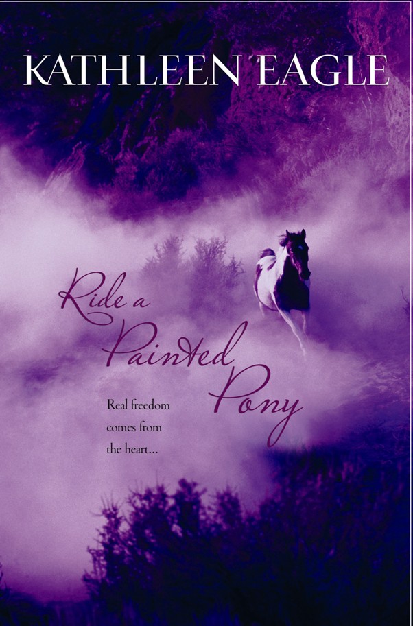
Let's hope this is my best-yet cover. Eveyone says so. This was the first incarnation. In the final version the title is white and "pops" better. I know shirtless hunks are still popular, but horses have generally been good to me. RIDE A PAINTED PONY is due out in hardcover in late November, and cover treatment for hardback books tend to be more "up market." Read: subtle and classy.

My first galloping horse was widely copied. The book was THE LAST TRUE COWBOY, and the paperback (this one) was better than the blue hard cover. I think the orange was a good color choice.
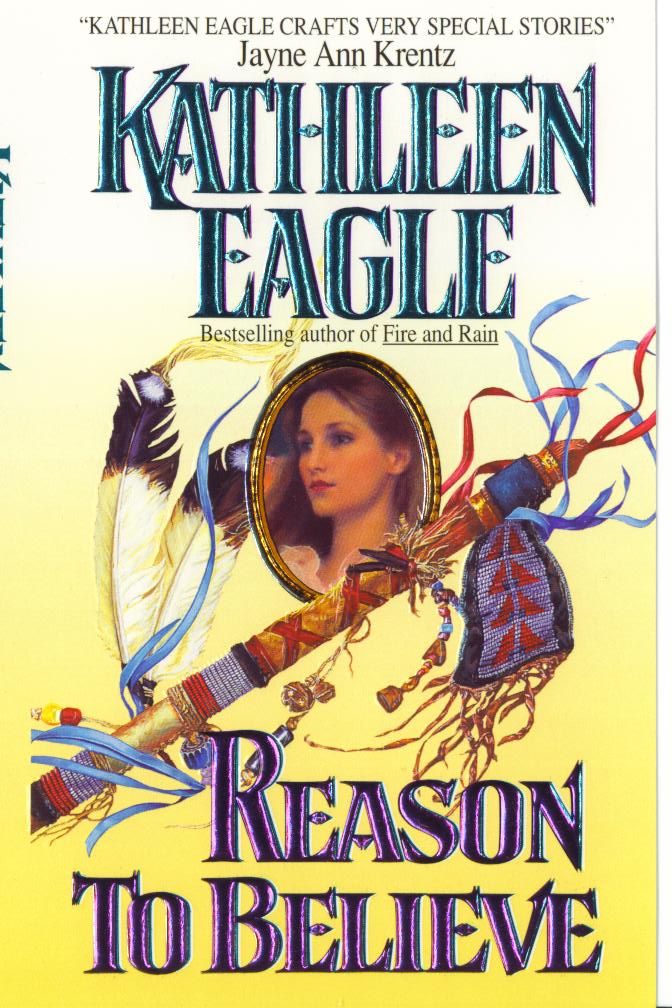
Finally, my least successful covers, which graced two of my favorite books. REASON TO BELIEVE is a contemporary story. The art department searched for a way to show the American Indian theme and women's fiction in a cover image. The hero is a pipe carrier, and they showed only the pipe stem at my request. It's considered disrepectul to display the pipe stem and bowl attached (which is why you should see them side by side in museum displays.) The result is a beautiful cover that probably says "historical" to the customer. That's deadly. The historical reader picks up the book, reads the blurb about a contemporary story, puts the book down. The contemporary reader never picks the book up. SUNRISE SONG is the other less successful cover. I'll spare you. The cover is a gold ball and a shaft of wheat. It says Wonder Bread to me. Originally the shaft of wheat was floral. I told them that nothing like that grows on the prairie, so they switched to wheat. Can't say I wasn't warned. My agent says that very often asking for a major change leads to a major bad-to-worse result because they're likely to do a "paint over". Sadly SUNRISE SONG is still the story that garners the most reader response.
Ah, covers.
5 comments:
I love the horse covers, Kathy, and it makes total sense why Reason to Believe would be confusing.
I'm getting really nervous about my first cover.
kathleen, i love that cover! beautiful.
i definitely thought reason to believe was historical. it's amazing that the people behind these covers are supposed to be experts.
i wish ste -- my agent -- would have told me that. i complained about the very gay man on the original Pale Immortal cover and surprisingly they redid it. (i was told other people in the house had the same reaction.) as nice as the current cover is, the original was much better. for the reason you mentioned. they just did some weird sketch-over that is just sloppy. i want my gay guy back!
helen, sorry we're scaring you! hopefully you'll get a knockout cover. i do think cover art is getting better all the time.
Helen, some of my best covers have come from Harlequin/Silhouette. I was always very thorough with the "art fact sheet." You give them every detail, choose the scenes you think would make the best cover, send them all kinds of pictures, and they really use what you give them. After a few books I was able to choose the artist. (My favorite Silhouette artist died a few years back--did lots of IM covers for Linda Howard, Nora, yours truly). The problem with mainstream covers it seems to me is that so many people in so many departments get a say.
Great "Pony" cover, Kathy! Congratulations! But for the record, I really liked the Teason To Believe" cover. I thought it was classy and eye-catching.
Post a Comment