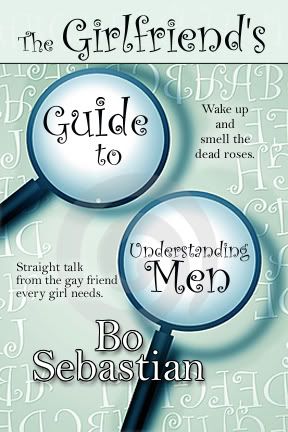
Well, it’s not so much a crisis as it is a “Hmmm….”
Is either of these two rough concepts a “wow” cover?
Do you hate them both?

Well, it’s not so much a crisis as it is a “Hmmm….”
Is either of these two rough concepts a “wow” cover?
Do you hate them both?
25 comments:
At first glance, I liked the one on the right with the magnifying glasses. It's more serious.
However, if this book is tongue-in-cheek, the cover on the left is more comedic. Hope that helps!
The first one pops. The second one is too much the same colors and doesn't jump out at me.
Frankly, neither one grabs me. The one on the left has better color. The one on the right focuses on the right words. Both too busy for me. I think the "straight talk" line is the best part. I'd pick it up for that.
Speaking of covers, Silhouette just put a face on my COOL HAND HANK (Feb). I posted him in the sidebar.
Good opinions!
Keep 'em coming!
I like the one on the right far far better, but the background color and font face need to be in bolder colors. That would solve the eye-catching problem, and the magnifying glass draws your attention. It's such a draw, that when the two images popped up, my eye automatically scanned and then went over to see what was magnified, which I think is so instinctual to us, it's a smart move for a cover. It's just that the colors are bland.
I really don't like the one on the left because it just looks like a cheap photoshop paste-up, or a pulp novel sort of throwaway.
(er, I sound really cranky, huh? Sorry about that!)
For me the one on the left looks pulpy. Since that's not my thing, I would assume right away that I wouldn't be interested. I prefer the one on the right, although it could be more colorful. And I agree that the "Straight talk" line is the best part. I don't care for the "Dead roses" line at all.
Rip and shred. I love it. You don't have to apologize.
I want real opinions.
This is very helpful to me.
I agree with most of the others - left one not so much and the one on the right if it was more colorful :)
Hate to sound like a broken record but even though I'm not crazy about either, the one on the right would be the best of the two if it were more colorful.
srry, deb, i'm not crazy about either but i kike the title.
There is definitely a theme developing here!
Other people should chime in to disagree or to toss more fuel on the fire.
Broken records are welcome because that lets me know how broken it is.
hot pink would catch the eye. You want to attract girls, right?
Ditto, what most everyone else has said. The only thing new I can add is that the magnifying glasses seem new and different. Catchy. The cover on the left seems too familiar.
"Wake up and smell the dead roses." has me going, "Huh?" But then I do that alot.
I'm with Kathy - love the "Straight talk ..." line.
Sounds like a fun book, Deb!
Kathy - I love your new cover and title!
Michelle-- Yes, the audience is definitely female.
Helen-- The magnifying glasses do seem fresh. I'm getting that now. It's not a tired look.
I would not pick up the cover on the left for a closer look. I do like the cover on the right.
okay Deb--here's my thoughts:
I don't care for either one.
Suggest:
change the color of the background on the magnifying glasses. i would see about going to the pink of that flower in the girl's hair on the left. Or! Oh--this might be better, change the color of the MAGNIFYING GLASSES (handle, strip around the glass) to pink and leave the green/gray back ground.
if you can work it in somehow, I think it would work if you could move the girl on the left onto the cover on the right. I'm not sure. I think you'll have to loose a mag. glass so it's not too crowded, but I like her expression.
sorry--something else was bothering me and I couldn't put my finger on it. the title is getting lost in the background.
so is the straight talk line-which like others, is wonderful. waht if you put 'guide to' under 'The Girlfriends' so that one of your magnifying glasses are freed up to highlight the straigh-talk line? sorry if this isn't making sense. my eyes are tired and I can't stop them from crossing when I looke at the screen
Deb: I'm a little confused because of the title. When I see Girlfriend's Guide, I think it's a girlfriend's advice. Shouldn't it be the Gay-friend's Guide to Understanding Men?
I also didn't quite get the dead roses line.
Keri & Christie--
I'm not the editor on this, so I may have put in an apostrophe that doesn't belong. So "Girlfriends" may be plural as in, "Come on, girlfriends. Gather 'round."
No one told me the "dead roses" line was out until today. Which is good because I didn't like it.
We're taking a look at hot pink and black and at focusing on the "straight talk" line.
Everybody likes that so you don't have to hit me over the head with a hammer. We're going to highlight it more.
The author is a hypnotherapist. We'd published him in the Mossy Creek series in fiction.
My eyes love to see the cover on Right :) more catching than the left one.
The one on the right would be my choice I guess, but I seriously rethink both of them. They just don't POP! You want something that's going to catch a person's eye over every other title.
I don't think I'd pick up either, but prefer the one on the right, but it needs better color, contrast, etc., as others have said. The one on the right looks like a comic book. Being a mystery writer with a science background, the magnifying glasses catch my eye.
I like the one of the left better, but I don't understand the title. Sounds like the advice is coming FROM a Girlfriend, not FOR girlfriends. I might be wrong, but don't guides "belong" to the person giving the advice? Which is the gay friend, in this case.
Maybe I have it mixed up...
Post a Comment