I mean, consider my latest novel. It’s got that big ol’ he-man arm on it. Great muscle, pretty color scheme, a little splash of plaid on the spine. Problem is, it has nothing to do with my book. Okay, the hero is a Highlander, but he’s a con man type of guy, a thinker, a charmer, not a warrior. And this is faaarrrrr from the worst cover offense I’ve been a party to. Often the hair color of the characters is wrong. Once the heroine’s name was incorrect. And a couple of times I’ve looked at my fresh-off-the-presses masterpiece and thought…who are these people and why is she humping his thigh.
 But then I remember romance covers from a few years back. Do you recall the doctors and nurses craze? How about when Fabio was king? Then there were the
 flower power books that didn’t shed a clue to the contents.
Some of those covers were bad. Some of them were wonderful. Some of them probably made their authors cry like spanked toddlers.
So, authors, tell us your worst cover nightmares.
And readers, what makes you buy a book? Do you judge a book by its cover? And what kind of cover do you like? The cartoon images are still going strong. Do you find them
 appealing? Or do you secretly long for the days of the clinch? How about flowers? Is it just easier to tote a floral pattern novel to the office, or do you carry your newest erotica loud and proud?
And authors...tell us your worst cover nightmares.
Pleaaaase. Cuz I’ve got some pretty ummm unusual covers coming down the pike, and I could use some input.
Then check back on Friday. I’ll pick a name out of the commenter hat and send the winner an Amazon gift card so she can buy any book cover that tickles her fancy.
24 comments:
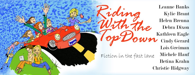
Personally, I love the cartoon-esque covers for contemporary books. But they always make me think "humor." And so far I haven't been disappointed-- I guess publishers "get" that part of the equation. Personally, I like a good clinch, but it has to be something really special to catch my eye these days.
One of my favorite covers was a stepback with flowers, foil, and huge letters with the title and my name on it. Inside, was the coolest barbarian-princess semi-clench art work I'd ever seen. Still one of my favorite covers ever.
But for matching cover with content. . . The Book of True Desires (Sept '06)takes the cake. They asked what I thought would be good on it. . . I said a stepped pyramid, a monarch butterfly, come jungle, and a delicious hung. Got ALL 4!!! Nearly swooned when the cover jpeg arrived in my inbox.
I don't know how much the cover helped to sell the book-- maybe it wasn't a factor for most people. But I was one happy author that day. So, I'm very proud of that book on all counts. And grateful to Berkley's art department for fulfilling a long-standing dream of having the cover I longed for on one of the best books I've written.
As for flowers-- heck, I'll buy flowers. But I prefer a stepback behind them. . . with some indication of what's inside.
And a big, hunky arm with sword-- Lois, I'm so. . . there.
LOL. . that sentence should read:
. . . a stepped pyramid, a monarch butterfly, some jungle, and a delicious hunk.
Sorry guys, I just couldn't let that hung-hunk mistake go uncorrected!
Betina, still laughing at the 'hung' statement.
Betina: I was so trying to figure out that sentence! LOL.
I have a truly awful cover on one of my books for Silhouette. The hero was an adventurer type so there's a map, a duffel bag, and then, to clue you in that there was a kid in the story, a teddy bear. A red teddy bear. Ugh.
Hey, are all your Minnesota girls okay? I'm seeing images of that bridge collapse and just feel sick to my stomach.
When I sold romance novels to Silhouette many years ago, I was very concerned about my cover being true to the book. I assumed the artists never actually read the book, but might appreciate some "visual aids" and helpful notes to make their job easier! So (without even asking permission), for my second novel, I sent my editor photographs of specific scenes (ie. Lake Tahoe, and a pic of the actual boat my characters rode on) as well as physical descriptions of the hero and heroine (listing hair and eye color, complexion, and even describing clothing they wore in the book) for her to send to the artist. I'm happy to say that it worked! The cover turned out exactly as I imagined it would! I wonder if anyone else has tried this technique? Maybe we should suggest that the publishers send us a form to fill out, with cover suggestions!
Lois-- My cover nightmare is easy. Back when I was writing Loveswepts, they decided to take *people* off the covers of their category romance novels. All you had was a flower border (generic) and then your title and name in really big letters. The books tanked big time.
Other than that I've loved my covers pretty much. My mother, saint that she is, had my editor track down the cover of my first book and bought it from the artist.
i dont hate much of the covers now, i don't look at covers tehn buy a book, it what inside taht counts
kim h
I enjoy perusing covers but that does not influence my purchase of a novel. I read the blurb at the back of the book. But I appreciate artwork of all types on covers. It is interesting to see how covers have evolved and the types of artwork for the various books.
Covers with striking images are usually an appealing sight to me. But I do like covers with scenes on them which connect with the book. These are my favorites.
I feel that it is important to have the cover relate to the book. But dramatic artwork is what I find attractive. Even if it is a flower or an individual I think that it should stand out and be enticing.
I will pick up a book if the cover catches my eye to see what it is about but I don't let the cover influence my buying decision. I like various kinds of covers. I like the tastefully done clinch cover, landscape and symbol covers, flower covers,etc. I don't care much for cartoon covers or covers where the characters don't look real.
If I am reading in public, I would rather read a book without a clinch cover.
The Superromance covers are always talking about how the covers make such a difference in sales.
I think people like the covers to represent the book, that's why the cartoon covers work so well. They tell you what to expect.
Supers tried "thing" covers, getting away from couples and romancey covers. They didn't sell as well.
I'm hoping I NEVER have a cover nightmare. Think I'll make it?
Browsing through covers gives me so much fun. This activity shows me what is popular now and I can see the changes that take place. What attracts me are colorful covers with scenes that depict a certain area. Also I do prefer realistic covers of people and landscapes as well as beautiful floral covers.
The cover will influence ne to pick the book up and read the back. Then it is up to the story to hook me into buying it. I like the cartoon look on some covers. I like covers to reflect the story in some way. Not too wild about the trend of almost naked people on the covers of mainstream books. You hate little kids looking at those. It's okay on erotica but for mainstream stuff it should be toned down a bit.
Covers are so important since that is what we see immediately when we start to look at books. I like to see a contrast in the colors, and deeper colors to me are richer and attract me. I like landscape scenes of various places and flowers.
I admit the cover is what initially draws me to a book because, for the most part, that is the first clue to the subgenre of the book.
I don't expect the characters to look anything like the cover, but if the cover is bright yellow with a 'flat' drawn woman/shoes/ect. I'm expecting something rather light and funny, along the lines of chick-lit. If it is a midnight blue with a leather clad figure mostly in shadows, I'm expecting a paranormal.
As long as the cover quickly communicates the genre and makes me go "yeah I feel like reading a paranormal today" I think it has done it's job. After that, I give it no thought at all.
The cover should be as closely connected to the story as possible. In that way at least I have an idea about the book. Ones that draw me to the cover as definitely real scenes of the place within the story, lovely floral designs as well as exceptionally beautiful color scheme within the design.
I'm a reader not a writer so a book cover usually draws my attention to the chance of me buying the book.
I admit that if a cover is beyond cheesy, it'll usually turn me off.
I remember when my mom bought LaVyrle Spencer's Years. The copy had the two characters on the cover without any clothes, but tastefully. She covered up the naughty bits with black ink so it wasn't quite as bad. Hey, I was only around 11 or so. :)
Wow. Thanks for all the imput. So...I have a question--what do you think of romance books that have just the woman on them?
Romance books with just the woman are great. I think that they offer a mystique to the book and i find them more fascinating than with a couple. For me the cover can be a mysterious combination of things, great use of color, wonderful shading and blending which adds to the entire attraction.
My cover nightmare was FROM THE DARK. Purple and...lurid. The couple (as my editor explained) were in the throes of passion.
Looked darn painful to me. Yuck.
Been watching the news off and on about the bridge collapse. So tragic. Me and mine are all well.
My daughter volunteered this morning at the bridge site, with the restaurant she works at. They brought free breakfast for the rescue workers. A girl of many words, and never at a loss, she was when trying to describe what she saw. Devastation. She said it looks so small on TV, but up close, well, it's a horrible thing.
My thoughts go out to all those families touched by this disaster.
Michele
I tend to pick up unknown authors by covers mostly. And some covers just look so "interesting" I pick those books up too....but if its one of my well-read favorite authors, I don't even glance at the cover.
Some covers are just way cotton candy..how did they get into THAT Position? ouch! Some are just so deliciously yummy that I pick them up hoping that the hero is just as yummilious.
I'm not a big fan of the cartoon characters, except like I stated if its one of my fave authors or if the books been highly recommended. I read books to take me into another world, and I just can't imagine a Jessica Rabbit world when Im reading...but things can happen!
I love to look at covers. They just keep getting better and better! But I've never run across a cover that made me buy the book, because I just had to have that cover. So even if you should end up with a cover nightmare, don't dispair, your fans will overlook it and buy the book regardless.
I also long ago stopped expecting covers to have anything to do with the contents of a book so I really don't judge a book by its cover.
Post a Comment