Yes, you're at the Rider's blog. Big surprise, eh?
Well, it's springtime, we figured. Time for a new dress or a new pair of sandals, or ... I know. A new blog header! And if you're going to have a new blog header, you're going to need a new look for your entire blog, especially if you're going for this kind of change.
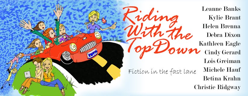
Actually, this has been in the works for a long time. Some months back we decided to do a little publicity, so we took out an ad in the Romance Writers Report. I contacted the son of some very good friends of mine to see if he could put together some art for us, and voila.
 Sounds easy, but it was a bit more complicated than that. Our artist gave us his initial interpretation and then we all had comments on changes. He went back to the drawing board and came up with a black and white line drawing of exactly what's up in our header. He then "colorized" it for us for the blog.
So who is our artist? His name's Dan Fletcher. that's a picture of him looking all hazy and cool! (Hi, Dan! LOL) He's a freelance graphic designer. He's currently a resident of Duluth and attending the University of Minnesota. He's done a wonderful job for us, so if you have any design needs, get in touch with him. He says he'll work for cheap!
 E-mail him at fletc092@d.umn.edu.
Oh, and here's another example of some of his artwork. It's says "Karma." And, as Michele says, maybe it'll give us good karma for the blog.
So we still have a few bugs to work out and the colors may very likely change (I was messing around with the purple) but what do you think of Dan's art work and our funky new look?
To get a more detailed look at Dan's drawing click here: Rider's in color
31 comments:
Hey Helen
I love the purple!
And Dan, I love our new header. Too cool! You did a great job.
It's a fun and funky new look for the Top down crew!
It looks great! Who's who in the car? :D
Love the KARMA monogram, Dan! You're very talented. And thanks for the great header artwork.
Who's who? I think we Riders should remain mysterious about that, eh? ;-)
Michele
Love the "karma" thing. . . think Dan is really talented! Now if we could just get rid of the purple! (Sorry Cindy!)
And hey, I thought somebody in the car was going to have glasses. Or I guess I have to get out the contacts!
:)Betina
What fun! Don't we look all spiffed up!
Helen was a trooper in organizing our new look. Honcho-ing the art comments was a lot like herding cats but look at the result.
Kudos, Helen!
And if we're voting, I'd vote for black so the text will pop and the eyes will have a nice classy rest.
But since I'm not doing it...I'm going to like whatever color Helen settles on. :)
Betina, the glasses chick is trailing along in the back! Second from the end.
M
I love the purple, wow!! This is so easy to read.
Love the new look! The purple is great and it is very easy to read.
I have a problem with the purple. Dark type on light background is easier to read. It just is. I'm sorry, but it could be my eyes. I can't imagine why. Lord knows the rest of me hasn't changed over the years.
The new look is great! I agree though, the white on purple is hard on the eyes.
The new look is fun, funky, and upbeat. I like it!
Hey, it looks great (and we can work through the background/text color issues)! I love Dan's Karma drawing too. I wish I had artistic talent like that!
Thanks, Helen, for all your hard work in coordination.
oh wow!!! loveitloveitloveit!!!!!
this looks AMAZING!!! what fun and energy! and some fantastic artwork!!!!
Oh, don't tell them who's who.
I think we should have a contest. Whoever matches the most riders with their caricatures wins!
Susie
Interesting, isn't it? Some folks love the purple and some hate it. Not much in between. Guess it is pretty dramatic.
We'll be trying a new color scheme tomorrow, so come check it out.
A contest of who's who would be fun. The only problem is I don't know who's who!!
Hey everyone this is Dan the artiest here! Im really glad everyone is happy with how the drawing turned out! The only things im a little sad about is that you lose alot of the detail of the picture from shrinkage n being on the internet, becasue I actually went in and accented all the edges and whatnot of the clothes and actually pretty much everything, with a darker version of the main colors that you can't see at all. But such is life haha. I had a lot of fun working on this for you guys and I wanted to thank Helen for giving me this opportunity, and trusting in my artistic ability even at the start when you had no idea if I was any good or not. Happy blogging!
dan, it looks fantastic, but i totally understand your frustration after putting so much into a project. helen, what about a link to the larger image? that might be cool.
Dan, I very definitely noticed the detail you put into this work. We tried to get it as large as we could. Unfortunately, the more we stretched it, the fatter all our faces got! LOL
Anne, that's a great idea about the link. How do I do that? Oh, can I do that on photobucket or something?
I'll give that a shot.
not sure about photobucket, but i know it can be done with imageshack. you can have a thumbnail that you click on that will take you to the large image.
Try the link. That gives some pretty good detail.
hehe!! oh, yeah!! that's great. i hadn't noticed the plate until i looked at the big image. and so many nice little details like jewelry and facial expressions. very cool!!
oh, and the karma design would make a great tattoo.
THat would make a cool tattoo, Anne. Hmm. I'd love to get one, but I just don't have the balls.
Humm. While the blue is very sedate and cool, Kathy, doesn't quite do it for me. FWIW: Feels like we lost a lot of the excitement.
But it's still beautiful!
i have to agree with cindy. this has a much more sedate feel where the other was energetic and funky. it was slightly harder to read though.
I'll switch colors late today. Be sure to check in and shout out!
Hum. Now we have cream. Nice. Quiet. :o)
Still miss the energy. It will be fun to see how many times the colors change before we decide on a final plan. Lord, I love choices ...
Don't like the cream. Prefer the blue to this.
On second thought, it kinda grows on ya.
Sunshine yellow. More energy? Just thought I'd compare with the cream.
I think I like the yellow better than the cream. Starting to think it really doesn't matter! The new layout looks nice, period.
Post a Comment